This ticket is about realizing what we found during T300040: Investigation: update Maki icons .
To do:
- Adjust size of icons to match previous version (at s/m/l sizes)
- Center icons.
- Verify that alphanumeric markers are centered.
- Agree on how missing icons from maki 0.5.0 will be aliased.
- Dynamic and static maps must be consistent.
Should be separate sub tasks:
- Document new icons, as well as aliased icons from maki 0.5.0, updating the help page. --> T312752
- Deploy to the beta cluster so we can validate. --> T315646
Code changes:
https://github.com/wikimedia/makizushi/pull/2
https://github.com/wikimedia/makizushi/pull/3
https://github.com/wikimedia/makizushi/pull/4
https://github.com/wikimedia/makizushi/pull/6
https://github.com/wikimedia/makizushi/pull/7
https://github.com/wikimedia/makizushi/pull/8
https://github.com/wikimedia/makizushi/pull/9
https://github.com/wikimedia/makizushi/pull/10
https://github.com/wikimedia/makizushi/pull/11
https://github.com/wikimedia/makizushi/pull/13
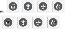
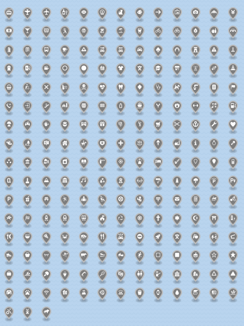
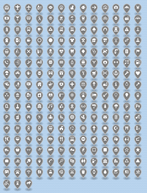
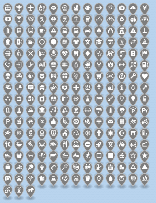
Icon grids:
Reviewing the "circle-stroked" marker at each size, we're pixel-perfectly centered and sized.
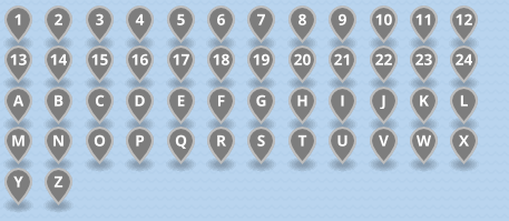
Maki 0.5 grids at small / medium / large:


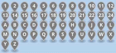
Maki 7 grids:
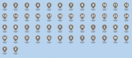
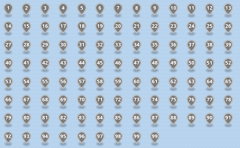
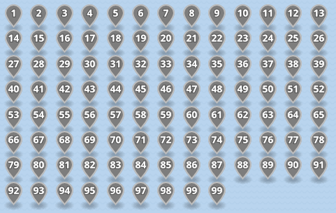
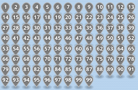
Here are the new numeric markers--at the moment, I haven't replicated the feature where the font size is decreased for two-digit numbers:
New letters: