designing interaction for creative pros /4
30 May 2016, 20:08
Part one urged to make a clear choice: is the software you’re making is for creative professionals, or not? Part two was all about the rally car and the need for speed. Part three showed the need to support the free and measured working modes of masters.
We start by revisiting the cars of part two.
party like it’s…
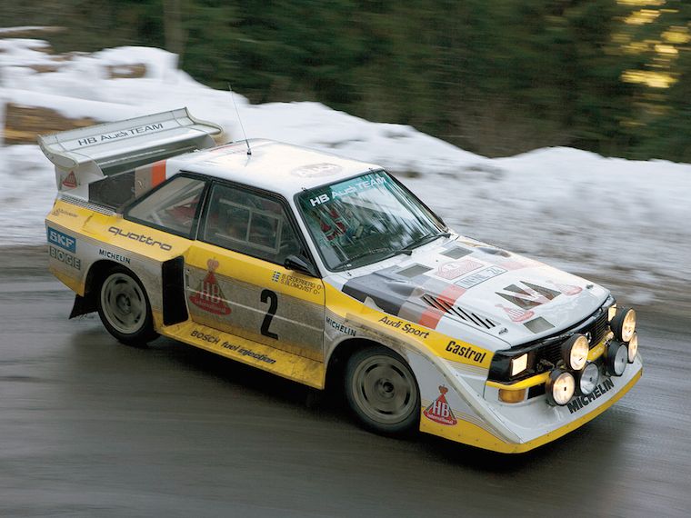
It is no coincidence that I showed you a 1991 family car and a 1991 rally car:
 source: netcarshow.com
and imgbuddy.com
source: netcarshow.com
and imgbuddy.com
I did that because our world—that of software for creative pros—is largely stuck in that era. And just like 1991 king‐of‑the‑hill cars (even factory‐mint examples found in a time capsule), this software is no longer competitive.
 yes, it’s pants! source:
charliepants.com
yes, it’s pants! source:
charliepants.com
It is my observation that in this field there is an abundance of opportunities to do better. If one just starts scratching the surface, on a product, workflow, or interaction level, then today’s software simply starts to crumble.
testing, testing, one two
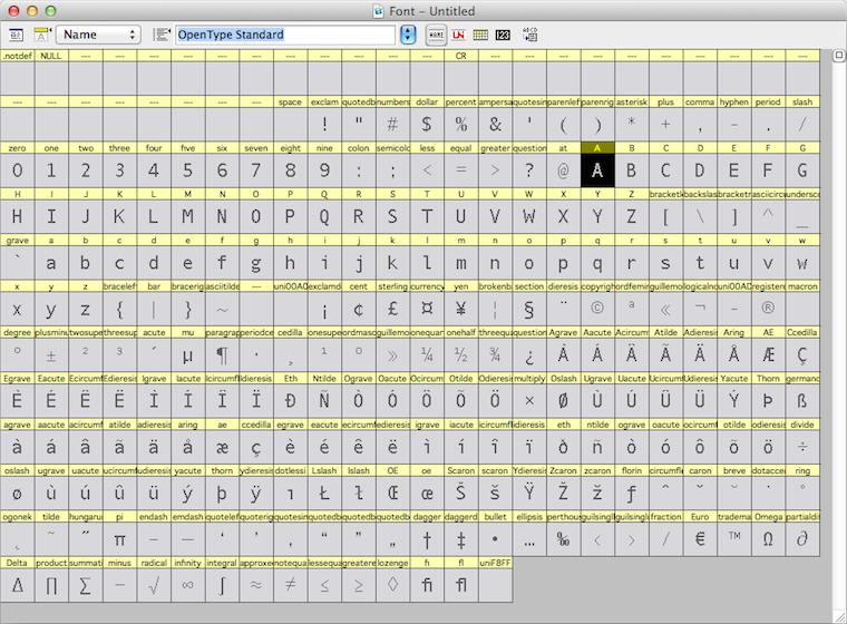
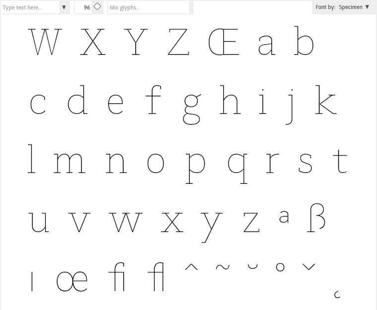
For instance, while doing research for the Metapolator project, I asked some users to show me how they work with the font design tools of today. They showed me the glyph range, the central place to organise their work and get started:
They also showed me the curve editor, where the detailed work on each glyph is done:
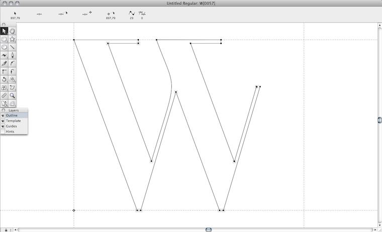
Both of them need the whole screen. In a short amount of time I saw a lot of switching between the both of them. I sensed wasted time and broken flows. I also saw tiny, slow handles in the editor. And I thought: this cannot be it.
They also showed me, in another program, designing in context:
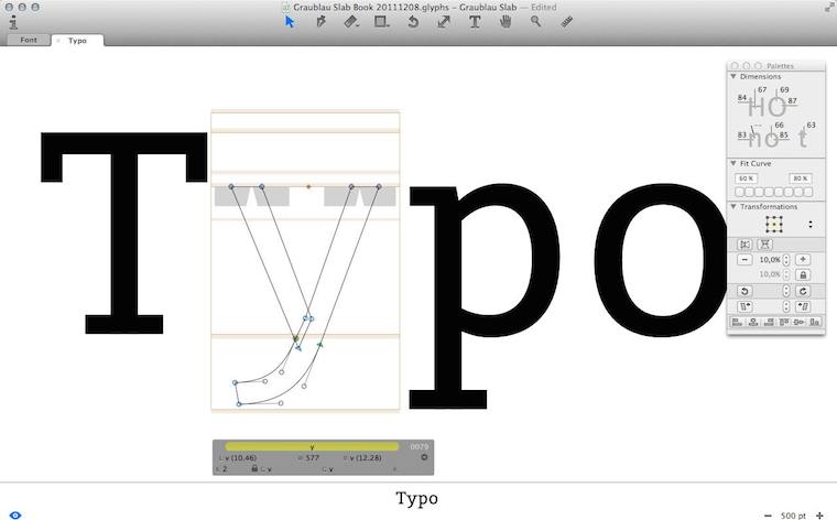
I immediately sensed this was a big deal. I saw that they had pushed the envelope—however, not broken through to the other side.
Besides that, I observed that editing was done in outline mode (see the ‘y’, above), but evaluation is of solid black glyphs. Again I sensed broken flows, because of switching between making and evaluating. And I thought: this cannot be it.
Frank sez…
Enough of that; let’s zoom out from my field report, to the big issue at hand. To paraphrase Zappa:
‘How it has always been’ may not be quite dead, but it sure smells funny.
The question is: how did we get to this situation? Let me dig through my experience to find some of the causes.
First of all we can observe that each piece of creative‐pro software is a vertical market product; i.e. it is not used by the general population; only by certain masters. That means we are in armpit of usability territory. Rereading that blog post, I see I was already knee‐deep into this topic: ‘its development is driven by reacting to what users ask for (features!) and fear of changing “like it has always been” through innovation.’
go on, have another cake
The mechanism is clear: users and software makers, living in very different worlds, have a real hard time communicating. Where they manage, they are having the wrong conversation: ‘gimme more features!’ —‘OK, if that makes you happy.’
What is happening today is that users are discussing software made yesterday. They are not able to communicate that their needs are so lousily addressed. Instead, they want some more cherries on top and this cements the position of this outdated software.
Constantly, users are telling software makers, implicitly and explicitly, ‘add plenty of candy, but don’t change a thing.’
This has been going on for decades—lost decades.
bond of pain
A second cause that I want to highlight is that both users and software makers have worked for years to get on the inside and it has been a really painful experience for all of them. This unites them against change.
Thus users have been fighting several frustrating years to get ‘into’ software that was not designed (for them; armpit of usability, remember), but instead made on terms favourable to the software makers.
Software makers spent year after year trying to make something useful. Lacking any form of user research, the whole process has been an exasperating stab‐in‐the‐dark marathon.
Thus a variant of the Stockholm syndrome spooks both parties. They are scarred‐for‐life victims of the general dynamic of the pro‑software industry. But now that they have gotten this far, their instinct is to sustain it.
the point
Two decades of experience shows that there is a way out of this misery; to become competitive (again). There is no incremental way to get there; you’ll have to snap out of it. What is called for is innovation—of your product, workflow, your interaction. A way that unlocks results is:
- user research
Experienced researchers cut straight past the wants and get the user needs on the table. (Obligatory health & safety notice: market research has nothing to do with user research; it is not even a little bit useful in this context.) - design‐driven innovation
When user needs are clear (see point 1), then a designer can tell you any minute of the project—first to last—what part of ‘how it has always been’ is begging to be replaced, and which part is the solid foundation to build upon. Designer careers are built on getting this right, every time.
Skip either point—or doing it only in a superficial, or non-consequential, way—and I’ll guarantee you’ll stay stuck in 1991. Making it happen requires action:
Software‐makers: enthusiastically seek out user researchers and designers and start to sail by them. Stop considering adding features a good thing, stop being a captive of ‘how it has always been’ and trust the accomplished.
picture show
To illustrate all this, let’s look at some of my designs for Metapolator. To be able to solve these problems of contemporary font design tools that I mentioned above, I had to snap out of the old way.
First of all, I pushed designing in context a lot further, by introducing in‑specimen editing:
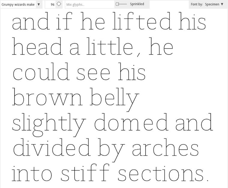
Every glyph you see above is directly editable, eliminating switching between overview and editing. The size that the glyphs are displayed in can be adjusted any given moment, whatever suits the evaluate/edit balance.
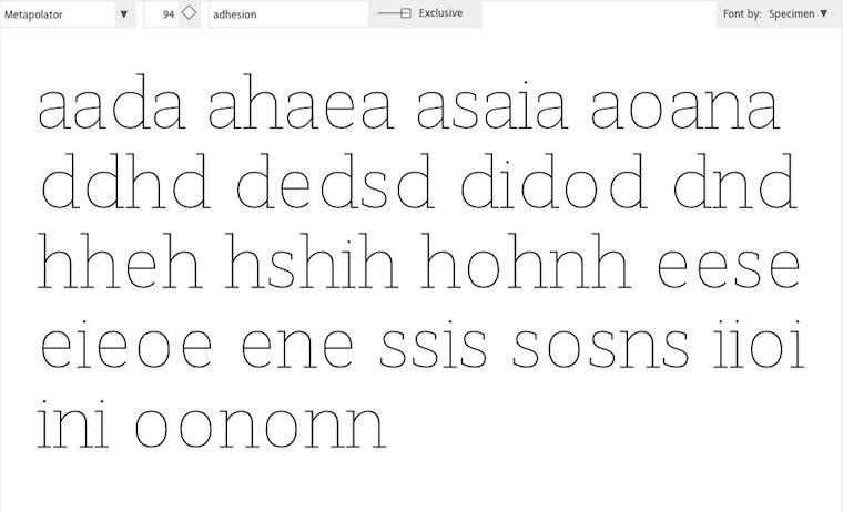
‘OK, that’s great’ you say, ‘but every once in a while one needs a glyph range to do some gardening.’ To address that, I used a handy trick: the glyph range is just another specimen:
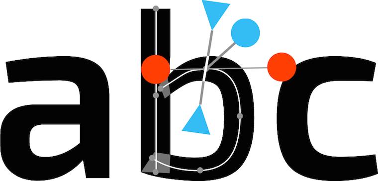
Everybody in the Metapolator team thought I was crazy, but I was dead set on eliminating outline mode. I sensed there was chance to do that here, because the focus moves from working at the edge of the glyph—the high‐contrast black–white transition—to the center line within:
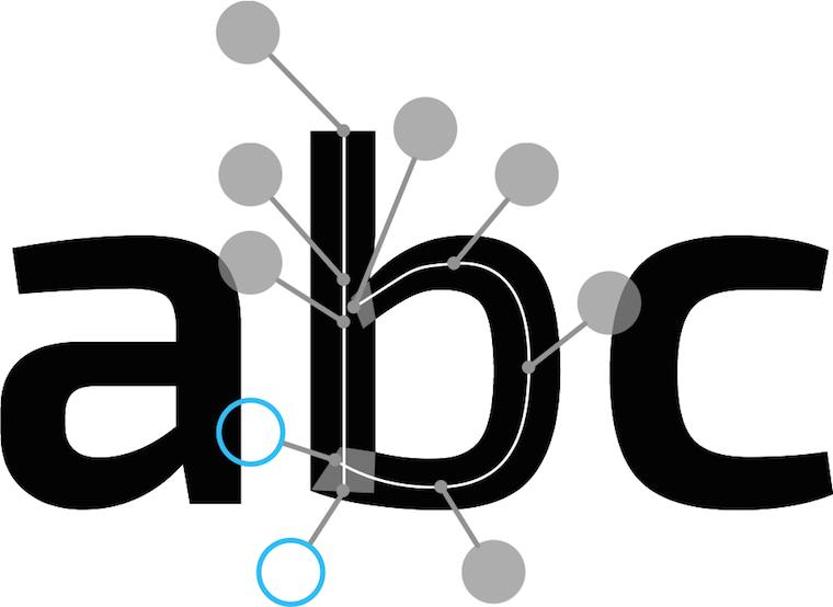
Then there was the matter of offering users generous handles that are fast to grab and use. After brainstorming with Simon Egli, the design shown above was born: put them ‘on sticks’ outside, so that they do not impede visual evaluation of the glyph.
pep talk
In closing: to be good in creative‐pro interaction, I encourage you to—
Do not ask how the past can guide you. Ask yourself what you can do to guide your software for creative pros into the 21st century.
Labels: design stage, lecture, metapolator, practical, product phase, top story

designing interaction for creative pros /3
4 June 2015, 10:13
two‐way street
There are two ways for masters to get the job done. The first way is to start somewhere and to keep chipping away at it until it is right:
 heads up: animated gif
So let’s throw in some material, move and size it (bam, bam, bam)—right, done. That was quick and the result is perfect.
like putty
This is called free working; squeeze it until it feels right. It is always hands‑on and I always move both my hands in a moulding motion when I think of it, to remind me what it feels like.
Although done by feeling, it is still fast and furious. Don’t mistake this for ‘trying out’, ‘fiddling’ or ‘let’s see where we end up’; that is for dilettantes. When masters pick up their tools, it is with great confidence that the result they have in mind will be achieved in a predictable, and short, amount of time.
on the other hand…
The second way for masters to get the job done is to plan a bit and then create a precise, parametric, set‑up:
This is called a jig. Now the master only has to ‘cut’ once and a perfect result is achieved:
 another animated gif
measure twice, cut once
This is called measured working. It is an analytical approach and involves planning ahead. It delivers precise results, to the limits of the medium. You will find it in many places; everywhere where the hands‑on factor is zero, parameters are entered and—bam—the result is achieved in one stroke.
It might be tempting to think that setting up the jig always involves punching in numbers. However also making choices from discrete sets, e.g. picking a color from a set of swatches, is part of it. Thus it is better to talk in general of entering parameters.
old‐skool
I did not make up all this by myself. I am indebted to this very cool book that goes deep into the matter of free and measured working, as practiced for centuries by masters. Luckily it is back in print:

Once familiar with this duality in how masters work, it can be used to analyse their workflows. For instance while reading this article about Brian Eno working with the band James.
In the sidebar (Eno’s Gear) it says ‘I don’t think he even saves the sounds that he gets. He just knocks them up from scratch every time’ about using one piece of gear, and ‘It’s stuffed full of his own presets’ about another. Reading that, I thought: that has, respectively, the vibe of free and measured working.
I have looped that insight back into my designs of creative‐pro software from then on. That is, giving equal importance to users building a collection of presets and knocking‑it‑up‐from‐scratch for tool set‑ups, configuring the work environment and assets (brush shapes, patterns, gradients, et cetera).
(There are more nuggets of that’s‐how‐masters‐work in the Eno article; see if you can spot them.)
the point
And with that I have arrived at rule numero one of this blog post:
All masters work free and measured; the only thing predictable about it is that it occurs 50–50, with no patterns.
We cannot rely on a given master taking the same route—free or measured—for all the different tasks they perform. It’s a mix, and a different mix for every master. Thus design strategies based on ‘remember if this user tends to do things free or measured’ are flawed.
We cannot rely on a given task being predominantly performed via either route—free or measured—by masters. It’s a mix, a 50–50 mix. Thus design strategies based on ‘analyse the task; is it free or measured?’ are flawed.
same, not same
The same master doing the same task will pick a different route—free or measured—at different times, based on the context they are in. For instance how difficult the overall project is. And for sure their own mood plays a role; are they under stress, are they tired (that night shift meeting that deadline)?
Masters will guesstimate the shortest route to success under the circumstances—and then take it.
dig it
With this 50–50 mix and no patterns, software for creative pros has only one choice:
Equal opportunity: offer every operation that users can perform in—at least—two ways: one free, one measured.
If you now say either ‘man, this will double my software in size’, or ‘yeah, my software already does that’, then my reply is: experience says that once we really start checking, you will see that current creative‐pro software achieves 60–80% equal opportunity.
how low can you go?
The question is not how do we prevent this list of operations from ballooning. It is: are there any more innocent, boring, easy to overlook operations to go on our list? For instance: setting the document size. Yeah boring, but often enough key to the creative result. A crop tool is the free way to do that operation.
From the Brian Eno episode above we have seen that it is not enough to filter the operations list by ‘does it change the creative end result?’ There we saw that meta‐operations (set up tools, configuring the work environment and assets) are also fully in scope.
picture show
To illustrate all this, let’s look at some of my designs for Metapolator.
 a final animated gif
This is measured central: the parameters panel. Literally here parameters are entered and—bam—applied. With the popup action shown the system is taken to the next level. Preferably for wide‐ranging selections, expressions of change (e.g. new value = A × old + B) can be built.
Most on‑canvas interaction is by nature of the free variety. The hands‑on factor is simply up for grabs. In Metapolator this interaction complements the parameter panel shown above to achieve equal opportunity.
Specimens are a huge factor in the Metapolator design. It is the place to evaluate if the typefaces are right. That makes it also the logical place to squeeze it until it is right: free working.
All on‑canvas interaction is performed directly in the specimens for this reason. If that looks natural and normal to you, I say ‘you’re welcome.’ This is completely novel in the field of font design software.
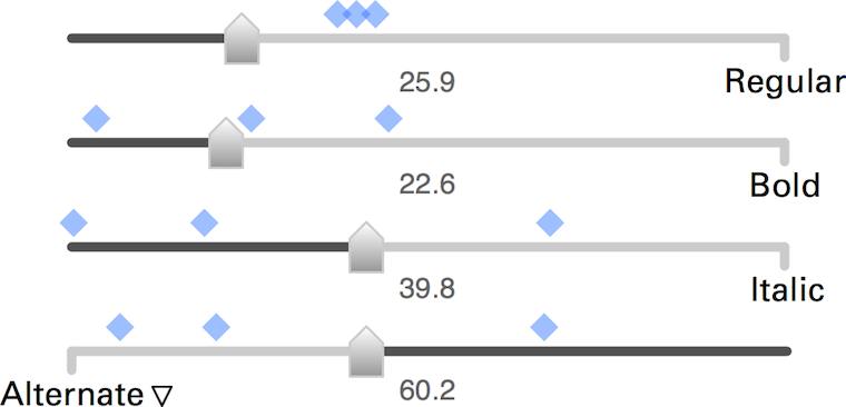
Here are these fellows again, the slider set for freely mixing master fonts to make new fonts. These new fonts are shown by the blue markers, so that users can feel the clustering and spread of these new fonts—clearly a component of free working.
The numbers you see are all editable, also quickly in a row. This supports measured working. That number input is straightforward and gives predictable and repeatable results was a big factor for me to choose the algorithm of these sliders over alternatives.
boom, boom
In short: software for creative pros has to offer every operation that users can perform in two ways: one free—squeeze it until it feels right—one measured—involving planning ahead, entering parameters and ‘cutting’ once.
That’s it for part three. Stay tuned for part four: how to be good.
Labels: design stage, lecture, metapolator, practical, top story
designing interaction for creative pros /2
12 May 2015, 19:29
(here is part one). Let’s check them out.
freude am fahren
First up is the family car:
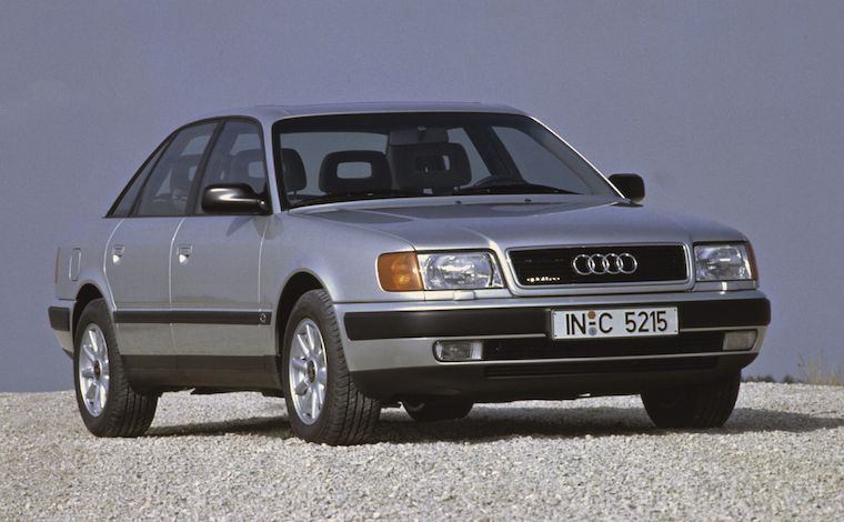 source: netcarshow.com
It stands for general software. It is comfortable, safe and general‐purpose. All you need to use it is a minimum of skills, familiarity and practice—in the case of cars this is covered by qualifying for a driving licence.
In the case of software, we are talking casual and enthusiast use. A good
example is web browsers. One can start using them with a minimum of skills and
practice. After gaining some experience one can comfortably
drive use a browser on a daily basis. If a pro web browser
exists, then it has escaped my radar.
(It would make a very interesting project, a pro web browser. But first a product maker would have to stand up with a solid vision of pro web browsing; its user groups; and some big innovation that is valuable for these users.
vroooom
When I think of creative pro interfaces, I think of this:
 source: imgbuddy.com
The rally car. It is still a car, but… different. It is defined by performance. And from that, we can learn a couple of things.
speed, baby
First, creative pros work fast. They ‘wield the knife’ without doubt. A telltale sign of mastery is the speed of execution. I have this in mind all the time when designing for creative pros.
I vividly remember one of the earliest LGMs, Andy Fitzsimon went on stage and demonstrated combining pixel and vector in one image. The pace was impressive, Andy was performing nearly two operations per second.
Bam bam bam bam. At a tempo of 120 beats per minute; the solid tempo of marching bands and disco. That is the rhythm I aim to support, when designing for creative pros.
command and control
Second, creative pros really know their material, the medium they work with. They can, and need to, work with this material as direct and intimate as possible, in order to fulfil creative or commecial goals. This all can be technology‐assisted, as it is with software, but the technology has to stay out of the way, so that it does not break the bond between master and material.
The material I am talking about is that of film, graphics, music, animation, garments, et cetera. These can be digital, yes. However data and code of the software‐in‐use are not part of a creative pro’s material. Developers are always shocked, angry, then sad to learn this.
Thus Metapolator, has been designed for font designers and typographers who know what makes a font and what makes it tick. They know the role of the strokes, curves, points, the black and the white, and of the spacing. They are experienced in shaping these to get results. It is this material that—by design—Metapolator users access, just that it is organised such that they can work ten times faster.
dog eat dog
Third, it’s a competitive world. Creatives pros are not just in business. Also in zero‐budget circles there are real fun and/or prestigious projects where exactly those with proven creative performance, and ability to deliver, get asked.
Tools and software are in constant competition, also in the world of F/LOSS. It is a constant tussle: which ones provide next‐generation workflows with more speed and/or more room for creativity? Only competitive tools make masters competitive.
the point
Now that we got the picture, here is the conflict. The rules—the law and industry mores—that make good family cars may be a bad idea to apply to rally cars. And what makes rally cars competitive, may simply be illegal for family cars.
Every serious software platform has its HIG (human interface guidelines). It is the law, a spiritual guide and a huge source of security for developers. That is, for general software. It is only partly authoritative for software for creative pros. Because truly sticking to the HIG, while done all in good faith, will render creative pro software non‐competitive.
vorsprung durch technik
Rally cars contain custom parts, handmade from high performance materials like aluminium, titanium, carbon, etc. This is expensive and done because nothing off‐the‐shelf is sufficient.
Similarly creative pro software contains custom widgets, handmade at great expense—in design and development. For a decade I have witnessed that it is a force of nature to end up in that situation. Not for the sake of being cool or different, but all in the name of performance.
tough cookie
So, with loose laws and a natural tendency for custom widgets, can you do just what you like when you make creative pro software? Well no. It is tough, you still have to do the right thing. If this situation makes you feel rather lost, without guidance, then reach out and find yourself an interaction designer who really knows this type of material. Make them your compass.
picture show
To illustrate all this, let’s look at some of my designs for Metapolator.
Speed, baby! Big handles to select and move individual points on the skeleton of a glyph (i.e. direct control of the material). During a brainstorm session with Metapolator product visionary Simon Egli, he noticed how the points could be connected by rigid sticks to big handles.
I worked out the design with big (fast) handles available for furious working, but out of the way of the glyph, so it can be continuously evaluated (unbroken workflow).
This is a custom slider set for freely mixing master fonts—metapolation—to make new fonts. In this case four fonts, but it has been designed to easily scale up to nine or more; a Metapolator strength (vis‑à‐vis the competition).
One of the sliders—‘Alternate’—is in an “illegal” configuration; it is reversed. This is done to implement the rule that the mix of fonts has to always add up to 100%. There is special coupled behaviour between the sliders to ensure that.
The design of this part included a generous amount of exploration and several major revisions. Standard widgets and following the HIG would not deliver that every sliders setting maps to one unique font mix. Apart from a consistency goal, that is also about maximising input resolution. So I broke some rules and went custom.
This is also a metapolation control. In this case a three‐dimensional one involving eight master fonts. Working with that many fonts is really a pro thing; you have to know what you are doing and have the experience to set up, identify and pick the ‘good font’ results.
The long blue arrow is a font family, with nine or so fonts as members. The whole family can be manipulated as one entity (i.e. placed and spanned in this 3‑D space) as can each member font individually.
Final example: complex selections. Across three different fonts and three different glyphs, several points have been selected. Now they can be manipulated at the same time. That is definitely not consumer‑grade.
If that looks easy, I say ‘you’re welcome.’ It takes serious planning ahead in the design to allow this interaction; for the three fonts to appear, editable, at the same time; for deep selections within several glyphs to be possible and manageable—the big handles‑on‐sticks help also here.
vroom, vroom
In short: if there is one thing that I want you to take away from this blog post, then it is that image of the rally car. How different its construction, deployment and handling are. Making software for creative pros means making a product that is definitely not consumer‑grade.
That’s it for part two. Go straight to part three: 50–50, equal opportunities.
Labels: design stage, lecture, metapolator, practical
designing interaction for creative pros /1
7 May 2015, 19:23
The lecture coincided with the launch of the demo of Metapolator, a project I have been working on since LGM 2014. All the practical examples will be from that project and my designs for it.
see what I mean?
‘So what’s Metapolator?’ you might ask. Well, there is a definition for that:
‘Metapolator is an open web tool for making many fonts. It supports working in a font design space, instead of one glyph, one face, at a time.
‘With Metapolator, “pro” font designers are able to create and edit fonts and font families much faster, with inherent consistency. They gain unique exploration possibilities and the tools to quickly adapt typefaces to different media and domains of use.
‘With Metapolator, typographers gain the possibility to change existing fonts—or even create new ones—to their needs.
‘Metapolator is extendible through plugins and custom specimens. It contains all the tools and fine control that designers need to finish a font.’
theme time
That is the product vision of Metapolator, which I helped to define the moment I got involved with the project. You can read all about that in the making‑of.
One of the key questions answered in a product vision is: who is this for? And with that, I have arrived at what this blog post is about:
Products need a clear, narrow definition of their target users groups. Software for creatives needs a clear definition whether it is for professionals, or not.
Checking the vision, we see that Metapolator user groups are well defined. They are ‘“pro” font designers’ and ‘typographers.’ The former are pro by definition and the latter come with their own full set of baggage; they are pro by implication.
define it like a pro
But what does pro actually mean? And why is it in quotes in the Metapolator vision? Well, the rather down‐to‐earth definition of professional—earning money with an occupation—is not helping us here. There are many making‐the‐rent professionals who are terrible hacks at what they do.
Instead it is useful to think of pros as those who have mastered a craft—a creative craft in our case. Examples of these are drawing, painting; photographing, filming, writing, animating, and editing these; sewing, the list goes on and on.
Making software for creative pros means making it for those who have worked at least 10.000 hours in that field, honing their craft. And also making it for for the apprentices and journeymen who are working to get there. These two groups do not need special ‘training wheels’ modes; they just need to get their hands dirty with the real thing.
the point
The real world just called and left a message:
making it for pros comes at a price.
First of all, it is very demanding—I will cover this in the follow‑up posts. Second, it puts some real limits on who else you can make it for. Making it for…
- pros
- is perfectly focussed, to meet those demanding needs.
- pros + enthusiasts
- (the latter also known as prosumers.) This compromises how good one can make it for pros; better keep in check how sprawling that enthusiast faction is allowed to be.
pros + enthusiasts + casual users- forget it, because pros and casual have diametrically opposite needs. There is no room in the UI for both, and with room I mean screen real estate and communication bandwidth.
pros + casual users- for the same reasons one can royally forget about this one too. Enough said.
the fall‐out
You might think: ‘duh, that speaks for itself, just make the right choice and roll with it.’ If it was only that easy. My experience has been that projects really do not like to commit here, especially when they know the consequences outlined above. And when they did make a choice, I have seen the natural tendency to worm out of it later.
I guess that having clear goals is scary for quite a few folks. Having focussed user groups means saying ‘we don’t care about you’ to vast groups of people. Only the visionary think of that as positive.
Furthermore, clear goals are a fast and effective tool to weed out bad ideas, on an industrial scale. That’s good for the product, but upsets the people who came up with these ideas. So they renegotiate on the clear goals, attacking the root of the rejection.
no fudging!
In short: define it; is your software for creatives made for pros, or not? Then compile a set of coherent user groups. In the case of Metapolator the ‘pro’ font designers and typographers fit together beautifully. Once defined, stick with it.
That’s it for part one. Here is part two: a tale of cars.
[editor’s note: Gee Peter, this post contains a lot of talk about pros, but where is the creative angle?] True, the gist this post is valid for all professionals. The upcoming parts will feature more ‘creative’ content, more Metapolator, and illustrations.
Labels: lecture, metapolator, practical, process, product phase, product vision
writing a product vision for Metapolator
25 April 2014, 22:01
Metapolator is an open project and it was the first time I did the session online, so you have the chance to see the session recording (warning: 2½ hours long), which is a rare opportunity to witness such a highly strategic meeting; normally this is top‐secret stuff.
boom boom
For those not familiar with a product vision, it is a statement that we define as ‘the heartbeat of your product, it is what you are making, reduced down to its core essence.’ A clear vision helps a project to focus, to fight off distractions and to take tough design decisions.
To get a vision on the table I moderate a session with the people who drive the product development, who I simply ask ‘what is it we are making, who is it for, and where is the value?’ The session lasts until I am satisfied with the answers. I then write up the vision statement in a few short paragraphs and fine-tune it with the session participants.
To cut to the chase, here is the product vision statement for Metapolator:
‘Metapolator is an open web tool for making many fonts. It supports working in a font design space, instead of one glyph, one face, at a time.
‘With Metapolator, “pro” font designers are able to create and edit fonts and font families much faster, with inherent consistency. They gain unique exploration possibilities and the tools to quickly adapt typefaces to different media and domains of use.
‘With Metapolator, typographers gain the possibility to change existing fonts—or even create new ones—to their needs.
‘Metapolator is extendible through plugins and custom specimens. It contains all the tools and fine control that designers need to finish a font.’
mass deconstruction
I think that makes it already quite clear what Metapolator is. However, to demonstrate what goes into writing a product vision, and to serve as a more fleshed out vision briefing, I will now discuss it sentence by sentence.
‘Metapolator is an open web tool for making many fonts.’
- There is no standard template for writing a product vision, the structure it needs is as varied as the projects I work with. But then again it has always worked for me to lead off with a statement of identity; to start answering the question ‘what is it we are making?’ And here we have it.
- open or libre? This was discussed during the session. At the end Simon Egli, Metapolator founder and driving force, wanted to express that we aim beyond just libre (i.e. open source code) and that ‘open’ also applies to the vibe of the tool on the user side.
- web‑based: this is not just a statement of the technology used, of the fact that it runs in the browser. It is also a solid commitment that it runs on all desktops—mac, win and linux. And it implies that starting to use Metapolator is as easy as clicking/typing the right URL; nothing more required.
- tool or application? The former fits better with the fact that font design and typography are master crafts (I can just see the tool in the hand of the master).
- making or designing fonts? I have learned in the last couple of weeks that there is a font design phase where a designer concentrates on shaping eight strategic characters (for latin fonts). This is followed by a production phase where the whole character set is fleshed out, the spacing between all character pairs set, then different weights (e.g. thin and bold) are derived and maybe also narrow end extended variants. This phase is very laborious and often outsourced. ‘Making’ fonts captures both design and production phases.
- many fonts: this is the heart of the matter. You can see from the previous point that making fonts is up to now a piecemeal activity. Metapolator is going to change that. It is dedicated to either making many different fonts in a row, or a large font family, even a collection of related families. The implication is that in the user interaction of Metapolator the focus is on making many fonts and the user needs for making many fonts take precedence in all design decisions.
‘It supports working in a font design space, instead of one glyph, one face, at a time.’
- The first sentence said that Metapolator is going to change the world—by introducing a tool for making many fonts, something not seen before; this second one tells us how.
- supports is not a word one uses lightly in a vision. ‘Supports XYZ’ does not mean it is just technically possible to do XYZ; it means here that this is going to be a world‐class product to do XYZ, which can only be realised with world‐class user interaction to do XYZ.
- design space is one of these wonderful things that come up in a product vision session. Super‐user Wei Huang coined the phrase when describing working with the current version of Metapolator. It captures very nicely the working in a continuum that Metapolator supports, as contrasted with the traditional piecemeal approach, represented by ‘one glyph, one face, at a time.’ What is great for a vision is that ‘design space’ captures the vibe that working with metapolator should have, but that it is not explicit on the realisation of it. This means there is room for innovation, through technological R&D and interaction design.
‘With Metapolator, “pro” font designers are able to create and edit fonts and font families much faster, with inherent consistency.’
- With “pro” font designers we encounter the first user group, starting to answer ‘who is it for?’ “Pro” is in quotes because it is not the earning‑a‐living part that interests us, it is the fact that these people mastered a craft.
- create and edit balances the two activities; it is not all about creating from scratch.
- fonts and font families balances making very different fonts with making families; it is not all about the latter.
- much faster is the first value statement, starting to answer ‘where is the value?’ Metapolator stands for an impressive speed increase in font design and production, by abolishing the piecemeal approach.
- inherent consistency is the second value statement. Because the work is performed by users in the font design space, where everything is connected and continuous, the conventional user overhead of keeping everything consistent disappears.
‘They gain unique exploration possibilities and the tools to quickly adapt typefaces to different media and domains of use.’
- exploration possibilities is part feature, part value statement, part field of use and part vibe. All these four are completely different things (e.g. there is inherently zero value in a feature), captured in two words.
- quickly adapt is a continuation of the ‘much faster’ value statement above, highlighting complementary fields of use for it.
‘With Metapolator, typographers gain the possibility to change existing fonts—or even create new ones—to their needs.’
- And with typographers we encounter the second user group. These are people who use fonts, with a whole set of typographical skills and expertise implied.
- possibility to change is the value statement for this user group. This is a huge deal. Normally typographers have neither the skills, nor the time, to modify a font. Metapolator will open up this world to them, with that fast speed and inherent consistency that was mentioned before.
- create new goes one step further than the previous point. Here we have now a commitment to enable more ambitious typographers (that is what ‘even’ stands for) to create new fonts.
- to their needs is a context we should be aware of. These typographers will be designing something, anything with text, and that is their main goal. Changing or creating a font is for them a worthwhile way to get it done. But it is only part of their job, not the job. Note that the needs of typographers includes applying some very heavy graphical treatments to fonts.
‘Metapolator is extendible through plugins and custom specimens.’
- extendible through plugins is one realisation of the ‘open’ aspect mentioned in the first sentence. This makes Metapolator a platform and its extendability will have to be taken into account in every step of its design.
- custom specimens is slightly borderline to mention in a vision; you could say it is just a feature. I included it because it programs the project to properly support working with type specimens.
‘It contains all the tools and fine control that designers need to finish a font.’
- all the tools: this was the result of me probing during the vision session whether Metapolator is thought to be part of a tool chain, or independent. This means that it must be designed to work stand‑alone.
- fine control: again the result of probing, this time whether Metapolator includes the finesse to take care of those important details, on a glyph level. Yes, it all needs to be there.
- that designers need makes it clear by whose standards the tools and control needs to be made: that of the two user groups.
this space has intentionally been left blank
Just as important as what it says in a product vision is what it doesn’t say. What it does not say Metapolator is, Metapolator is explicitly not. Not a vector drawing application, not a type layout program, not a system font manager, not a tablet or smartphone app.
The list goes on and on, and I am sure some users will come up with highly creative fields of use. That is up to them, maybe it works out or they are able to cover their needs with a plugin they write, or have written for them. For the Metapolator team that is charming to hear, but definitely out of scope.
User groups that are not mentioned, i.e. everybody who is not a “pro” font designer or a typographer, are welcome to check out Metapolator, it is free software. If their needs overlap partly with that of the defined user groups, then Metapolator will work out partly for them. But the needs of all these users are of no concern to the Metapolator team.
If that sounds harsh, then remember what a product vision is for: it helps a project to focus, to fight off distractions and to take tough design decisions. That part starts now.
Labels: metapolator, product phase, product vision
If you like to ask Peter one burning question and talk about it for ten minutes, then check out his available officehours.
 Peter Sikking is an
experienced
Peter Sikking is an
experienced
interaction architect. He unabashedly puts
shipping great products at the centre of his design practice. He is known for
his work for Google, Nokia, the
Metapolator &
GIMP
open source projects,
and startups.
What is Peter up to? See his /now page.
- info@mmiworks.net
- +49 (0)30 345 06 197
- imprint
